Finding the perfect neutral
I thought it would be an appropriate time to repost how we came to find the perfect color for the bulk of our home while my in-laws are trying to find the perfect color for their home they are remodeling out here.
During the process of trying to find the perfect color for the bulk of our home, I realized we needed to stick with warm colors because of our dark flooring, iron work and stone. The grey I had envisioned was sadly not going to become a reality in our home.
You know what?
It’s OK!
It’s OK!
I also found that this was something a lot of you were going through, I wasn’t the only one wanting to change out our beige for something a little more sophisticated.
After lots and lots of research, many trips to the paint store and lots of samples I have learned a lot. I am by no means a color expert, but I do feel like I can make a home comfortable and loved with a bit of elegance.
So below you will find some tried and true colors, all of which came highly recommended. I posted a picture of the color, the color used in a room and any other details I thought you might find helpful in trying to find that perfect
neutral.
Monroe Bisque
Just a true beautiful beige good for the entire home.
Bits of golden/yellow undertones
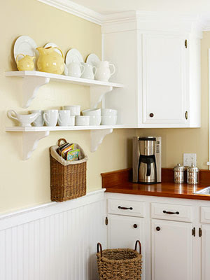
BHB
Next up is Quincy Tan which gives off a soft brown hue
Decor Pad
Grant Beige
Neutral beige
Neutral beige
Blue-green undertones definitely lets out a grey hue.
I loved this color but it was a little too light for our home. I did use this for my stencil paint.
Very popular with the designers, if you google this color you will find all sorts of information.

Traditional Home
Shaker Beige
This color is part of the Historic Color collection from Benjamin Moore most popular palette.

Decor Pad
Smokey Taupe–
Grayer tones but still warm, goes well with brown furniture and white trim.
Very classic color, designer favorite.
This colour is increasing in popularity because of the new trend towards grey.
Decor Pad
Pismo Dunes
Very pretty taupe but it showed up very dark in my home.
Very pretty taupe but it showed up very dark in my home.
First sample on the left
decor pad
Muslin
Warms up the walls and replaces white.
Red undertone, if it could reads pink use Manchester tan below if this occurs.
Manchester Tan
Warms up the walls and replaces white.
slight green undertone
You will find this color used all over in the pottery barn catalog.


Decor Pad
Hush Benjamin Moore
I personally loved Hush but just a little too light in our home.

Apartment Therapy
Amazing Grey Sherwin Williams
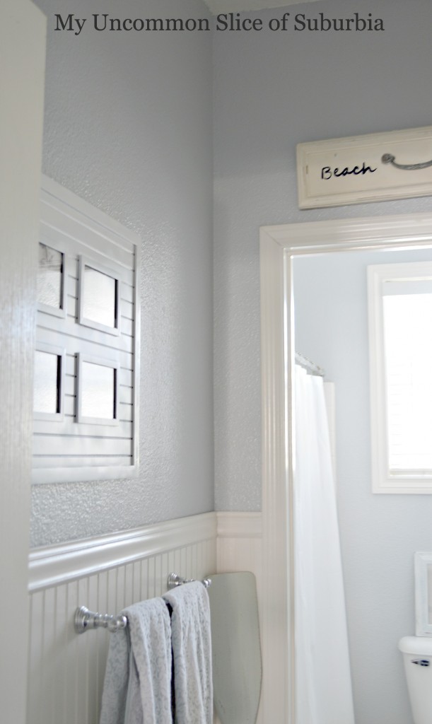
I absolutely love this color but it was too cool for our home. We did however paint the downstairs bathroom with this color!
I absolutely love this color but it was too cool for our home. We did however paint the downstairs bathroom with this color!
And the winner!!!
Bleeker Beige
Falls in between beige and taupe but has a small hint of grey. Most popular wall colours found in newly built houses and show homes along with Greenbrier Beige
Goes with anything, slight grey undertone, sophisticated, perfect for our home!
Claire Watkins
So that about sums up my findings on paint, I hope it will help you along your journey to finding the perfect neutral.
Remember, once you have gone to the paint store and picked out your favorites, tape the sample cards to the wall. From there buy samples of them to paint on your wall. Make sure you look at them in the morning, afternoon and evening, they will look different’ as the light changes. Pick the one that works well with your flooring, furniture and looks best to you!
Have a wonderful day, thanks for stopping in today!






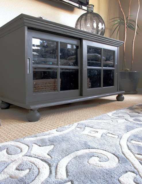
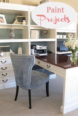
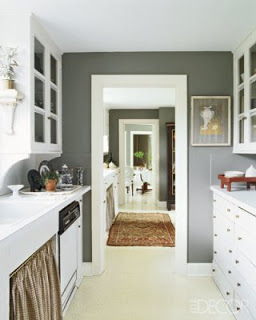
I love these colour Kristin… they are so warm, and can make the same house more confortable than it was before… just changing a colour! It's incredible how the power of colour can be!
This morning I changed my mind about the main colour of my new house.. and I choose it a little bit darker… we will see what will come! 🙂
Kisses
Etta
Gorgeous inspiration to draw from, so lovely!! You'll nail the colour, your taste is divine Kristin. Happy chosing, love Posie
Great analysis! Choosing is never really easy and I tend to tack up the paint chip on the wall for about a week or so to really compare. Love Bleeker Beige! btw: your stencilling looks fantastic 🙂
Thank you for "time" spent…wow! lots of helpful information:)
First, I want to say that I love gray but it isn't for my home either:(
Second, I wish I would have had this post about a month ago. I used the same color that we used in our home in Cincinnati. I didn't have my furniture down here to pick out another color. I used Latte (by Porter but color matched) and I am really hoping that it isn't to brown. This house is smaller and it will look different. Wish me luck. I am nervous about it.
I've made my share of mistakes with paint to know that your many trips to the paint store were well worth the trouble. The light in a room makes such a difference to the way the paint will look on the wall.
Great advice on getting a right paint color, it is really one of the hardest elements to get right and often does require a bit of trial and error! Test, test and test!! Janell
Awesome post, love the information! Glad you found the right one!
Cindy
xo
i'm really into gray and beige/linen
and having the hardest time picking paint currently for our new (to us) home!
i'm totally diggin the smokey taupe.
going to run to ben moore and test it out.
do you have any recommendations for pulling off
gray and a neutral color together?
or is it unheard of. LOL
our house has HUGE walls and vaulted ceilings it has LOTS of natural light… our furniture is black/drk brown…. our floors will soon be dark walnut 5" wood. trims are white.
i love your blog.. i'm always coming here for inspiration! thanks for ALL you do!
What a beautiful colors!!………..lovely……happy evening…love Ria..
Crazy girl-
Yes you can use the linen/grey and tan together. I'm keeping my great room beige which is open to the rest of the house. If you e-mail me I'll send you pictures when it's done so you can see what it looks like. This was also one of my issues, it had to match! If you use the Ben Moore Aurora line (sp) all of the colors are meant to mix with each one, you can't go wrong 🙂
Take care
Kristin
Oh my I cannot believe I just found this old post! I’ve been struggling to choose paint for a year! I have Bleeker Beige trim and wainscoting. I thought I found several perfect wall colors but when I got my furniture it has no green undertones and looks great w smoky taupe or stone hearth wall color. My condo is also a great room 2 story w vaulted ceilings, windows and on the opposite wall with wainscoting so these colors fade into nothing and do not compliment the Bleeker Beige. Any suggestions???
Kim
Isn't is amazing at how different colors look in various rooms! All the undertones and shades really come out! Thank you for the tips, they are all beautiful colors. I am so happy that they invented paint samples!! 🙂
Kristin what a great post with so many great colors for readers to use. Tried and true is a good place to at least start. I always tell clients choose three different undertones as samples then you can see which direction you need to go as far as undertones, value and finish. I think you more than did that with all of your samples. I also say use poster board, at least and 2×3 sample with at least 2 coats if not 3 to get all the pigments to show true. Move it around the room throughout the day and live with it at least 3 days. What feels right very first thing in the morning will most likely feel right 2 yrs or 10 yrs from now. We have a clear mind in the morning after analyzing a color all day, we can talk ourselves in and out of a color several times. So glad you found your perfect mix, Kathysue
Wow…aren't you nice to do all of our legwork. Now we all just need to pick a color. What a great post. Thanks for all your information Kristin 🙂
Thank you Kristin for sharing your homework!
We tried clay beige, muslin, sandbar, and manchester tan for our lr. We went with manchester tan and I love it so much! It looks great at every time of day, in every light. Its not too yellow, pink or green. It is almost cream in some light and more tan in others. I think it's the perfect beige. I looked at some of the others you mentioned too, and lots of them are really nice also, we just needed something really light.
Hi my friend,
How are you?
Love the beige colour which is the winner..yes perfect mix between beige and taupe..so warm and inviting. You have a fabulous taste!
Giving you a big hug,
Rozmeen
It's so funny that you posted this. We just painted one of our guest rooms Manchester Tan over the weekend. I went back and forth trying to decide which neutral would look the best, and I'm SO glad that I chose that one. Great post!
Those paint colors sure are tricky!! I can't believe that one that showed so blue on your wall… it looks so different in the swatch. I love the one you chose! xoxo
Very nice choice! Thanks for this post. Great colors. I am sure to use one for sure somewhere : )
Neutrals can be so tricky- thanks for sharing all your info!
Great color choice Kristin! You can never go wrong with neutrals. I used Hush in one of my rooms last year and still love it.
Love the color and can't wait to see the changes!
Debbie
I used the shaker beige in my DR and Kitchen and love it. It looks so nice against the white molding. You can't go wrong with any of those choices though.
Thank you for putting this together Kristin! Such helpful info is so appreciated, I could have spent days coming up with these choices! You're as generous as you are creative! 🙂
Kristin- I think that picking paint colors is one of the hardest things I ever have to do when it comes to decorating. I always buy sample pots and paint them in several places to see how they will look with internal and external light sources. I LOVE the color you chose- xo Diana
Love them all! I used to have deep gray walls in my laundry room and absolutely loved it. These are great neutral color choices. Definitely will keep these in mind when it’s time to paint again.
I love all your examples. Yes, beige colors can be hard to choose. We have Monroe Bisque in our kitchen/hall/family room area. It does give a warm glow to the space.
-Shelley
Help!!! Just painted my house bleeker beige – looks good in the day – but looks too green at night.
I’m looking for a warm greige ( more beige then gray ) – my house faces north and has lots of “warmth” in area rugs, curtains, couch etc. HELP!!! pleas need a recommendation, thank you in advance.
Excellent article. I will be facing some of these
issues as well..